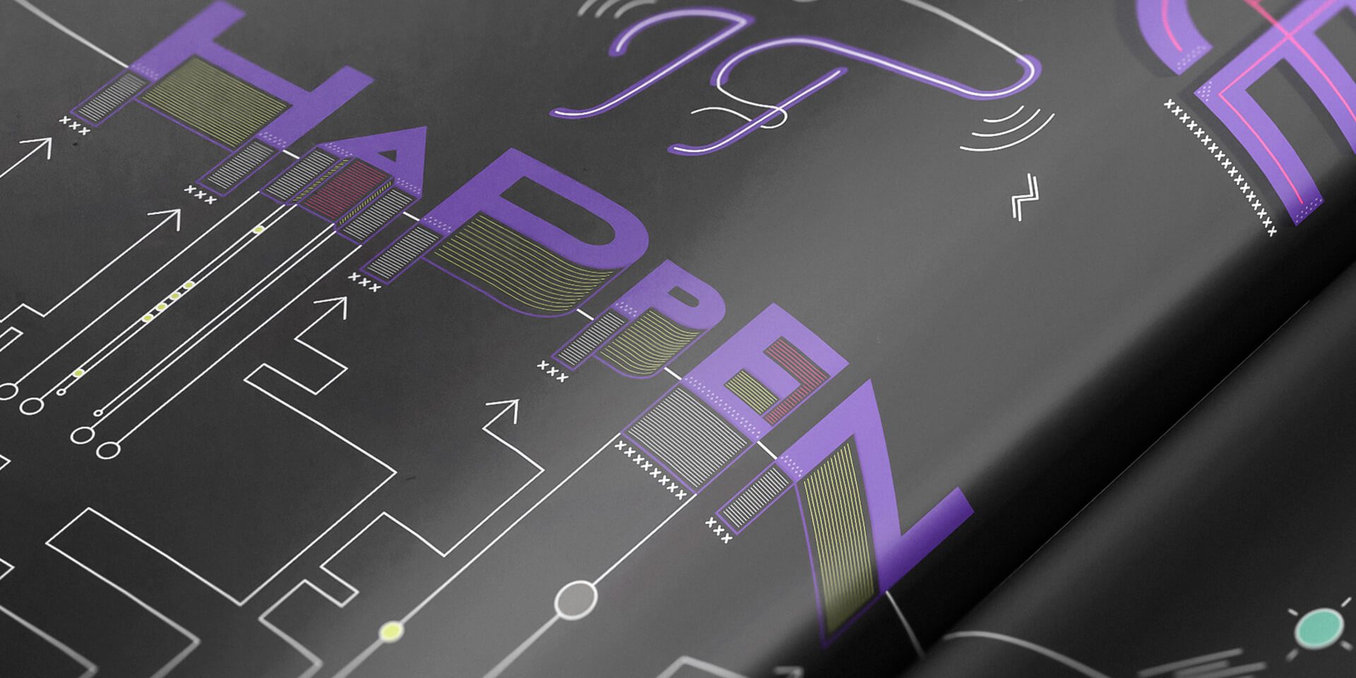
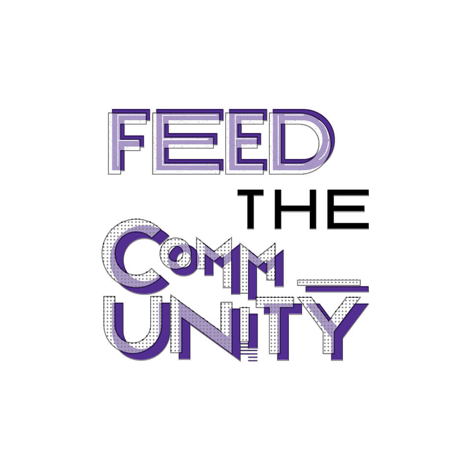
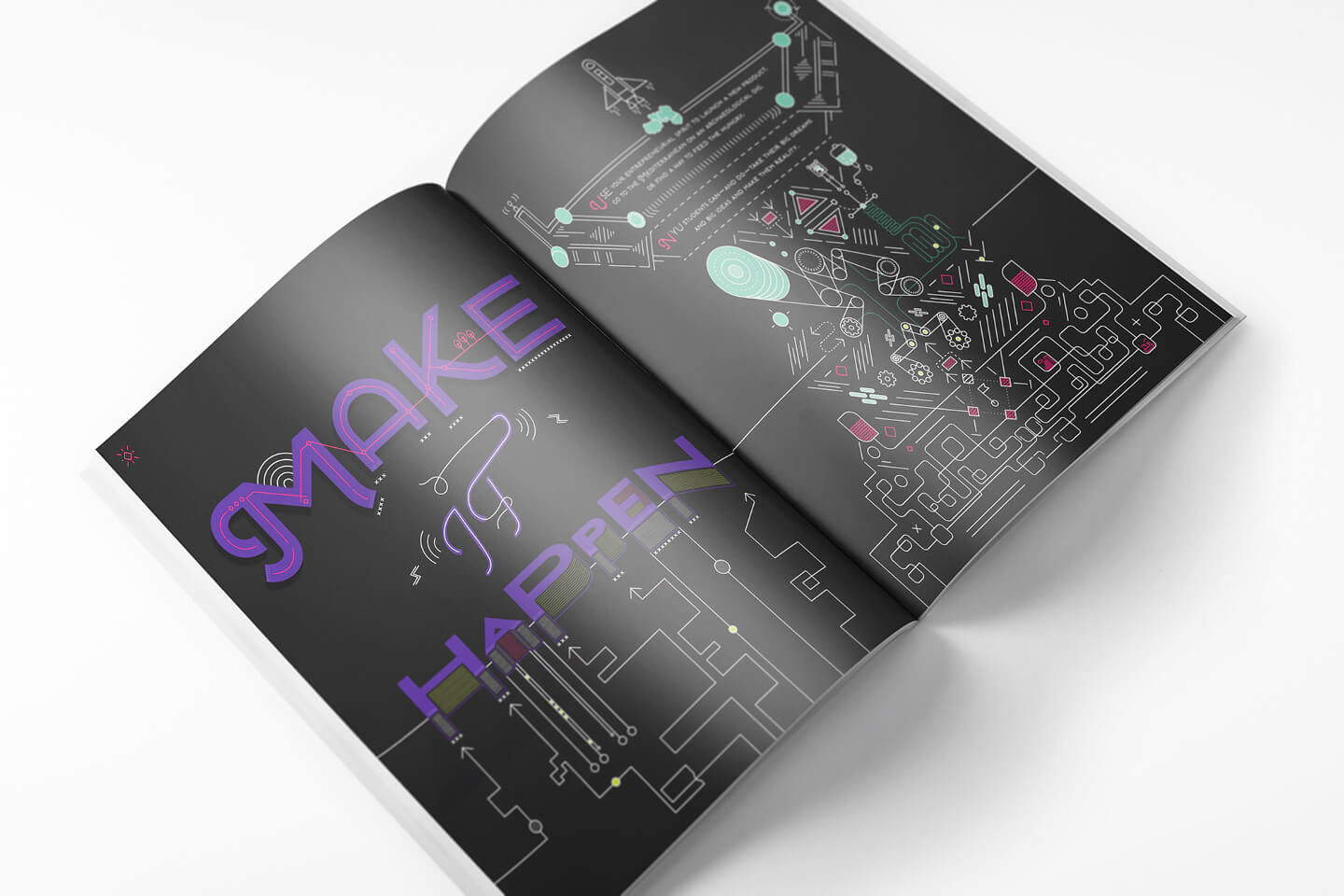
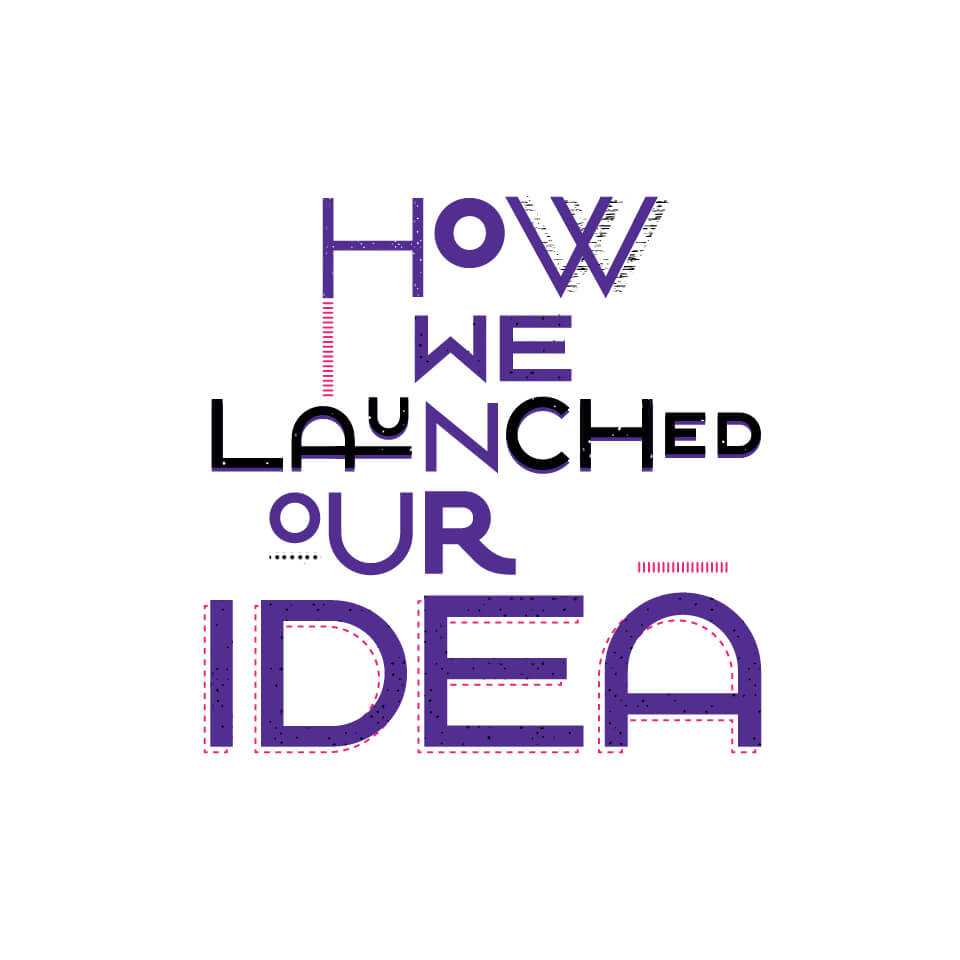
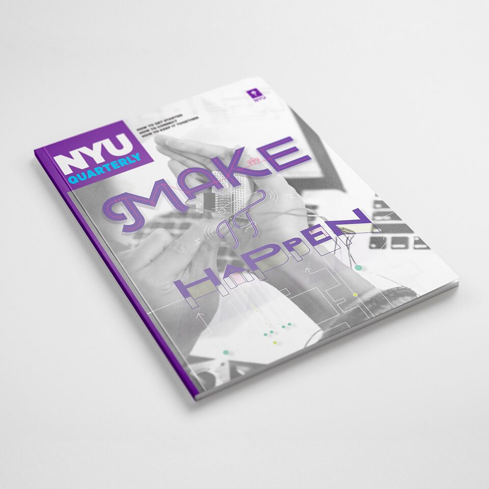
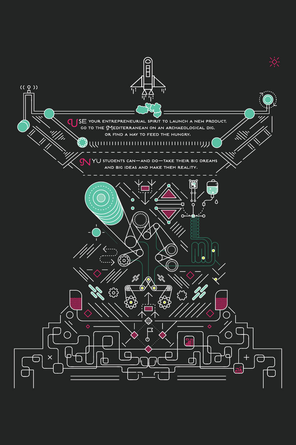
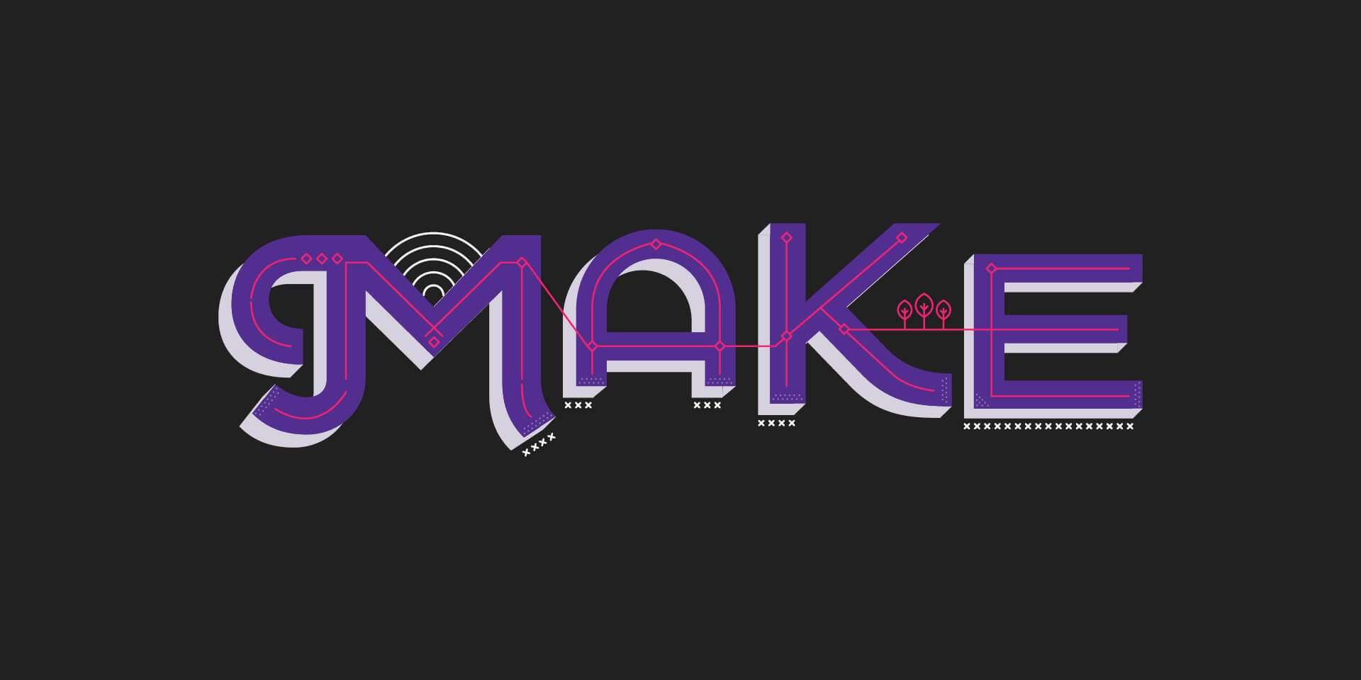
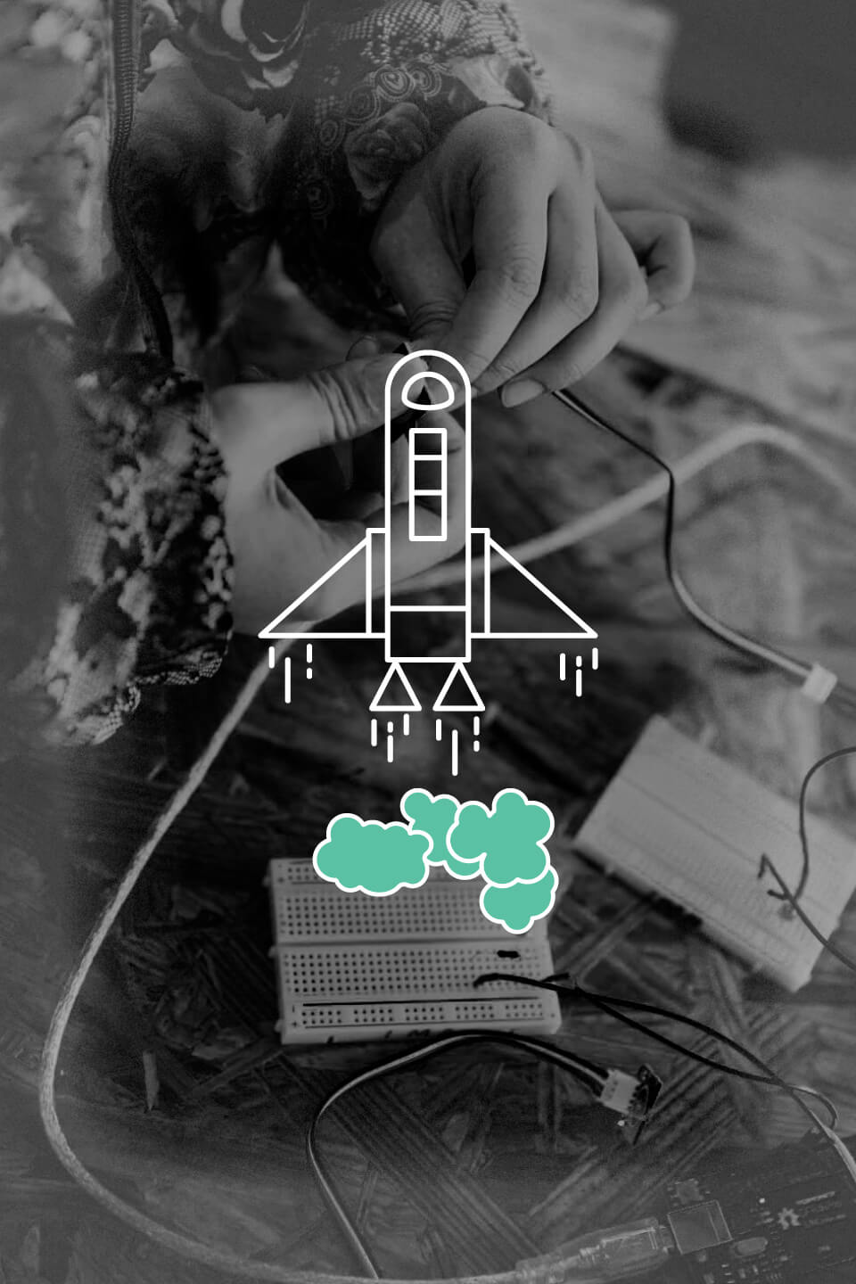
Q, a quarterly magazine for prospective students of New York University, features bespoke illustrations to support each edition's theme. Chris Browne, the Art Director of NYU's Marketing Department asked for our help to create the illustration and art direction for their “Make It Happen” installment. The featured content highlights both students and alumni who are pushing the boundaries of innovation in tech. Interoperation immediately came to mind as a theme to creatively run with; students working with students, students working with faculty, and omnichannel relationships with the university pushing the tech needle to ultimately "Make It Happen.”
This project was made in collaboration with the NYU marketing team.
Team
Tyler Mintz
Christopher Browne
Our Role
Art Direction
Illustration
Lettering
Graphic Design
davidwhitepond
close
Q, a quarterly magazine for prospective students of New York University, features bespoke illustrations to support each edition's theme. Chris Browne, the Art Director of NYU's Marketing Department asked for our help to create the illustration and art direction for their “Make It Happen” installment. The featured content highlights both students and alumni who are pushing the boundaries of innovation in tech. Interoperation immediately came to mind as a theme to creatively run with; students working with students, students working with faculty, and omnichannel relationships with the university pushing the tech needle to ultimately "Make It Happen.”
This project was made in collaboration with the NYU marketing team.
Team
Tyler Mintz
Christopher Browne
Our Role
Art Direction
Illustration
Lettering
Graphic Design


This is a unique website which will require a more modern browser to work!
Please upgrade today!